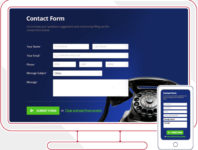
Believe it or not, a contact form is one of the most critical parts of your website. Your readers or customers may want to contact you for any number of reasons, from offering feedback to asking a question or even just commenting on what you are doing. They may have complaints, compliments or concerns.
Either way, if they are frustrated a poor contact form can make them more so. If they are happy, a poor form can turn them into someone who is frustrated and unhappy. Your contact form is important, yet, but you need to consider several factors to make them effective. Here are seven tips.
K.I.S.S. It
You need to K.I.S.S. your forms. This means you need to keep it super simple. The worst thing a customer can find on your site is a complex and time-consuming contact form or one that is hard to find. Make a contact form a part of your menu and sitemap, and make it clear what it is.
Don’t use a fancy design or large images around your form. Remember, many users will be accessing it on a mobile device, and not only does it need to be compatible, it needs to be easy to load, see, and fill in even on a smaller screen. Find WordPress contact form plugins that are right for your site, and use them to construct the simplest forms possible.
Use Few Fields
Use as few fields as possible, and only include the ones that are necessary to fill out to contact them. Be sure your privacy policy is present and clear, so they know this information won’t be used to spam them, but simply to answer their inquiry.
The typical fields are first and last name, or even just first name, and email along with the comments or concerns section. If you have accounts, you may want to ask them to log in, or to give you their account number so you can address customer needs more quickly without having to look things up.
Don’t just think of making it easy for you though. Use methods that make it simple for the customer to contact you in the way they feel most comfortable.
Use Conditional Logic
Conditional logic means that if the user makes certain selections, fields that are essential will appear. For instance, you can ask if the customer wants to receive a phone call or text message. If they select no, nothing happens. If they select yes, a field appears for them to enter their phone number and contact preference, call or text.
This means not all fields are present, so if they are not necessary, the user never sees them. This keeps your forms clean, neat, and simple.
Offer Contact Options
This leads to another area. You need to offer your customer contact options. This means offering them ways to be contacted that they are comfortable with, from email to phone, text, or even video chat or online text chats.
The more options you offer, the more users will not only trust you, but will feel more secure and confident in contacting you, even if they do not use those methods themselves. What it shows is that you are available and that you care about their needs. The fewer options you have, the more standoffish you seem.
You want your connection to feel warm and friendly, but not forced. Offering more options is a simple way to do that.
Offer Additional Solutions
If the user has a question, a contact form is a good place to offer them other options like an FAQ page or a forum where they might find ready answers to their concerns. The faster you can get them answer, the sooner their issue will be resolved, and if it is a common issue, the answer may be a simple one you don’t want to waste their time with.
Still, offer human contact as an answer. For some customers, this is the best solution regardless of how simple the answer might be.
Prevent Spam
Answering contact forms takes a lot of time, and it is best if you can prevent spam, bots, and trolls. Having a captcha or some other form of entry security is a good way to prevent this. However, a word of caution here: don’t force users to create and account or sign in here. Your contact form, just like your shopping cart, should allow for guest contact just as you allow guest checkout. This will keep those concerned about privacy and security engaged.
Answer Promptly
The number one key to making contact forms effective is to answer promptly. Do so as rapidly as you can, within 12 hours if possible, faster during business hours. This lets your customer know you are paying attention, but it also prevents them from going to a competitor’s site because they are not getting the answers they need.
Using contact forms effectively is critical to your site success. Follow these seven tips to make sure your contact form is working effectively for you and your customers.

